
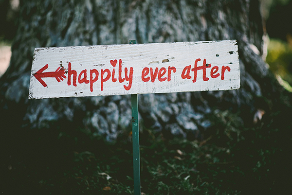
Book covers are the first bit of customer-facing marketing that your reader will ever see. They’re a shortcut—telling the reader in shorthand that they’ll like this book, that it’s in the genre they love to read, and that the person who wrote it is someone they can trust with their valuable (often limited) reading time. That’s a lot of information to pack into one image, and still make it effective. So what’s the secret psychology behind choosing a good cover?
And choosing … there’s a reason we’re describing covers as a choice the author makes, rather than harping on the idea of do-it-yourself versus hire-someone cover design (at least for the moment—we’ll get to this later).
Few things sell your book as successfully to a new reader as your cover. Regardless of how you come to the cover, you’re going to make a few choices before your book goes live. So it’s a good idea to have as much preparation as you can get, to work out exactly what you should be looking for in a good cover design, and exactly what to avoid.
Let’s take a look at the elements, the philosophy, and the psychology of a good cover.
Image is Everything for a Book Cover
There are a couple of image-related philosophies that we need to look into, and one of them won’t be much of a surprise.
Choose an Eye-Catching Image
Humans are lazy. We’re constantly looking for ways to shortcut the decision-making process, and that includes looking for anything useful in helping us decide what we should read next.
Sometimes we make our reading choices based on factors such as the authors we already like, the books our friends are reading, the next book in a series, and on and on. But what about those times when we’re looking for something new? How do we discover a new work, from an author we’ve never heard of, and whom our friends have yet to discover?
There’s a reason people like to browse the shelves at book stores, or scan the best seller pages online. We’re looking for a book that has the right look for the mood we’re in, and for the sort of story we’re wanting to read.
And we’re good at this. We can scan an entire digital page or an entire physical display of books, and in seconds we’ll spot the one or two that make us feel that little twinge of excitement. Something about the cover—the tone of it, the action and drama, the artistic style—gets us to pick it up or click on it, and learn more.
So the first job of the cover image is to resonate with a particular reader. It needs to be exciting to them. It needs to tell its own story, and make its own promise about what the book will be about.
For fiction, readers want a hint of the action they’re about to experience. They want to be treated to a story before they ever crack open the cover.
NOTE: This does not mean that your cover needs to be a faithful reproduction of a scene from within the book. The image you use on a cover needs to be able to stand on its own, presenting the will-be reader with something thrilling that makes them want to learn more. If it helps, you can think of the cover as a ‘prequel’ to the story of the book, and the book itself as a ‘sequel.’
For non-fiction, you want to connect to your will-be reader on both an emotional and intellectual level. This is one of the few times when it’s appropriate to build visual puns and metaphors into your covers. An image related to your topic is the way to go, but there’s nothing that says you can’t push the symbolism a little.
Just remember to keep things clean—the non-fiction covers that perform best are nearly always simple in design, with all of the reader’s attention focused on the title and subtitle. Remember that the purpose of a non-fiction book is solve a problem (even if it’s entertaining in the process). So the imagery of your cover needs to funnel the reader’s attention to the problem you are solving.
Go Pro or Go Home

The second philosophy to bear in mind for cover imagery is professionalism. The image needs to tell the reader that A) you have the resources and the means to do this work at a standard above the hobby level, and B) you have the kind of respect for your readers that empowers, enables, and compels you to give them your best.
You’ve likely heard the advice a million times: “Hire a professional to do your cover. Don’t use cheap art, cheap titles, cheap layout.”
What you may not have heard, and thus never quite connected, is the psychology behind that advice:
Your cover is its own story, and readers are looking at it as a way to help them make a purchasing and reading decision.
If your goal is to attract new readers, you need to embrace this psychology, and have a strategy that plays to it. Choose art that tells its own independent story—related to your book’s story, for certain, but in no way trying to ‘tell your book’s story’ in a single panel.
BONUS EXERCISE
Take a look at the comic book industry. These are stories told with both text and images, and each comic has its own unique cover. The cover is designed to entice the reader, to get them to pick up the book. But it doesn’t tell the story in and of itself. It provides a scene—a hero in jeopardy, or performing some heroic act, or simply surprised by some off-screen revelation. That cover is there to get the reader to pick up the book and open it, and the story inside takes care of the rest.

Make Your Book Cover Genre Appropriate (Know Your Reader)
No self-respecting science fiction reader is going to buy a space opera story with a cover depicting a long-haired, shirtless man wearing pirate pants and standing on the prow of a wooden sailing ship, holding a buxom young beauty at his side as the waves crash around them. It doesn’t matter how many spaceships you put in the background.
Or they might … You know, people can be weird and funny.
But the odds are that readers of space operas aren’t looking for a cover that looks like a romance novel. And the opposite also holds true.
You already know this, instinctively. And the above example is an extreme, so it would be easy to spot. More subtle, however, and therefore more deadly (for book sales at least) are covers that seem close to being genre-appropriate, but skew aside just enough to tank sales.
For example, you have your space opera cover, with two starships colliding in combat, lasers everywhere. But the font used for the title is Comic Sans or Papyrus. Sure … these fonts are wicked awesome. But they don’t exactly scream “quality science fiction.” And worse, they don’t meet the expectations of the potential reader.
People gravitate toward the familiar. The more familiar something (or someone) is, the better the chances of attraction. When readers are looking for something new to add to their shelves, they want to know that it will be something similar enough to what they’re used to, and already enjoy, that it will fit with the books they already love.
Book Cover Layout for Eyeflow
Something we often may forget to consider, when deciding on a cover design, is flow.
An interesting fact about the design of our eyes—they’re made for movement.
Our ancient ancestors, way back before all the alien DNA tampering (if Ancient Aliens has taught us anything), had to develop a few skills and traits specifically to protect and provide for themselves in the wild. One of those traits was a set of eyes that were sensitive to movement.
We may not see the snake laying among the leaves, but we’ll notice when it moves.
We might not spot the rabbit hiding in the brambles, but when the little guy starts running we can zero in on him with a spear.
We may not be able to spot the sailboat in those stupid illusion paintings at the mall, but if the sailboat moves we’re all over it.
We notice things that move. Our eyes are designed to track, and that motion sends messages to our brain that trigger instinctive responses.
Just think about reading—your eyes are scanning the screen right now, left to right and then down the page, and as that happens you’re engaged and your interest is empowering your comprehension. If your eyes weren’t moving over this page, it would just be blocks of gray—nothing but a sailboat hidden in plain sight.
In book cover design, we need the eye to move.

Cover images are static. They have no motion of their own. They may portray action, but that isn’t quite enough to ‘sell it’ for us. This is where layout comes in.
Good layout causes the viewer to move their eyes around on the page, in a balanced and strategic way. Whether the reader’s eyes move from top to bottom, or from right to left, or vice versa, that’s entirely up to you. But a good rule of thumb is to mimic the eye movement of reading. Because your cover can be the primer for the experience you want your will-be reader to have.
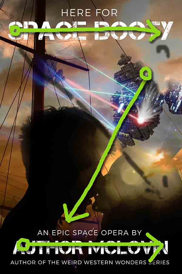
Three Snaps in a ‘Z’ Formation
One technique for optimal cover layout will move the reader’s eye from left to right, and from up to down, and usually in an ‘Z’ pattern.
There can be variations on this, for sure. And it’s far from the only correct way to lay out a cover. But the ‘Z’ pattern is a common strategy, because it engages the reader’s eyes in the same way the text will engage them, and so there’s a highly desired associative effect.
If the reader is thrilled by the cover image as they ‘read’ it, there’s a better chance they’ll assume the book will be equally as thrilling.
The technique is simple: Arrange elements of your cover so that the reader’s eye starts at the top of the image, moves left to right, then down at a diagonal, and finally left to right again.
You see this most often in covers that have either the title or the authors name at the top, some active image (usually weighted so that everything is happening on the right-hand side of the page) in the middle, and finally the title or author’s name (whichever is left) along the bottom.
‘Z,’ baby. Or ‘Zed,’ if you’re Canadian.
Controlling eye flow in an image allows you to invoke a sense of movement, and thus action. Action sells books. Invoking it is good.
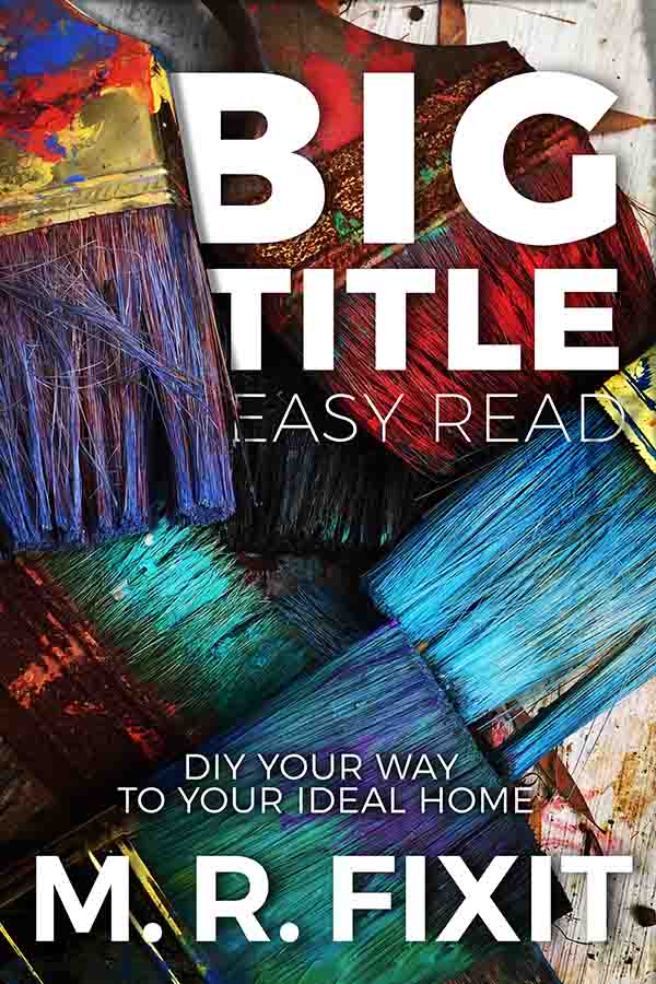
Big Title, Easy Read
There’s a separate psychology to book titles, which we’ll get to in a future blog post. But assuming you have a good one, and it’s capable of doing the job of grabbing reader attention and evoking a sense of curiosity and intrigue, there’s a bit of design philosophy that will help make your cover stand out and gain more positive attention.
And positive attention is good—because it could so easily go the other way.
Nothing wrecks a pretty picture faster than a title.
Fortunately for us, we’re not here just to sell pretty pictures—we’re trying to sell all those beautiful words wedged between the front and back cover of our book. And for that, a title can help carry some of the design load.
For starters, thinking back to the ‘Z’ layout we mentioned above, a title can help create weight and motion on the page, guiding the reader in the direction we choose, and helping their eye flow the way we need it to.
Titles are written—and we read from left to right. So titles usually need to be in a left-to-right position in our ‘Z’. For example, if you put the title at the top of the book, it’s the top of the ‘Z.’ And the bottom of the book—well, you get the idea.

Typography Tells the Tone
So now you’re thinking, “That means it always has to be at the top or the bottom!” But that isn’t necessarily true. Because even though we do read from left to right, the title of your book isn’t just a block of text.
There are a lot of rules, philosophies, and guidelines for good typography, but for our purposes let’s just agree to think of it as one more graphical element we can use for our cover design. As text, our title can help move the reader’s eye across the page in one direction, and that’s handy. But as a graphic, the title can do the same job in multiple directions, through its style and orientation.
A good text treatment on a title allows you all sorts of leeway in guiding reader attention. Having some sort of gradient or texture will lend visual weight to title, which actually allows you to control not only eyeflow but also mood.
Think about a title that starts out as bright at the top but darkens toward the bottom, and you’ll start to feel that it tells a story all its own—something ‘dark’ and frightening is going to go down.
Or, depending on other elements of the cover, it could also read as a hint that the story will ‘rise out of darkness and into hopefulness.’ Tricky things, these type treatments. But useful.
Aside from doing something graphical with the text, you might consider changing its orientation. Angled text, for example, can become the angled part of the ‘Z’ in your layout, and it has the effect of adding instant action and movement to the cover. It’s dramatic and intriguing, and a great shortcut for punching up a cover that would otherwise be blah.
NOTE: This doesn’t work for just any cover. A children’s story with an angled title might make it seem sinister—like some sort of horror novel with pictures of bunnies (shiver). So just like picking genre appropriate imagery, take a look around and see how other authors are handling text treatments on covers for books like yours, and go with something similar.
“Your name is Competing with Your Title for attention”
I’m going to admit something: The above statement is a personal pet peeve. I’ve had more than a few designers and fellow authors comment on the fact that I make my name nearly as large as (sometimes even larger than) the title of the book. There is a philosophy that your name should be a secondary, almost unnoticed typographical element on the page.
I don’t subscribe to that philosophy, and here’s why:
Earlier we mentioned that one of the shortcuts for readers to determine what they want to read next can be as simple as following their favorite author. So for starters, I want to make life as easy for those readers as I can. If they’re following me as an author, then I don’t want to leave breadcrumbs. I want to leave billboards.
Also, take a look around at some of your favorite traditionally published books, and tell me if you notice anything. Is Dan Brown’s name in 12-point type at the bottom of the book cover? Does Stephen King have his name tucked away unobtrusively in one corner? Is it difficult to determine if James Patterson had anything to do with the book you’re holding?
The truth is, one of the unconscious signs of an “indie published book” is the size and treatment of the author’s name. And though we all have immense indie pride, we still have to try to meet the expectations of our readers. And readers want to think of authors as being grand and larger than life.
Smaller, unobtrusive, unobvious type tucked into the bottom of the page sends a pretty clear psychological message: This author isn’t important.
Some disagree with this idea, of course. But you should consider that you became an author because you had stories to tell or you had wisdom to share (or both). You’ve worked hard to establish a relationship with your reader, so that they will return to you often. You’re building a brand around your name, so that people will see it and buy what you’re offering, because of the relationship you’ve built.
Why on Earth would you hide or obscure your name so that it’s the least noticeable thing on the cover? Be big. Be bold. Be the brand.
NOTE: There is a slight caveat here, and it’s worth calling out. One thing to avoid is making your title and your name the same size. Again, consider that your book cover’s design needs to have some motion. And since this is a static image, we have to settle on providing the illusion of motion. We do that by throwing things slightly off balance. One way to accomplish this is to make your title and your author name different sizes. Make one bigger than the other, and then put them in different positions. Bonus points if you can put them in counter positions, so that they look like an unequally weighted scale. But regardless of whether your name is in bigger type or smaller type than your title, the important thing to remember is that you want to avoid equal treatment for both. Weight one heavier than the other, to create a sense of movement and depth on the page.
A Thumbnailable Book Cover
It may not be a word, but it’s pretty important—and it’s probably the most overlooked aspect of cover design:
You need to consider what your book cover will look like as a thumbnail.
It doesn’t matter how gorgeous your book cover is. It doesn’t matter how well it’s laid out. It doesn’t matter how big and bold your titles and your name may be. None of that matters a bit … if it’s invisible when the cover is shrunken down into a thumbnail.

In our digital age, the first time someone sees your book cover is most likely in a grid of other covers, and at the size of a postage stamp. That tiny little rectangle is all your reader gets to make their very first decision about you and your book.
So everything else aside, one of the most important aspects of cover design is the answer to this question: How well does it scale down?
When you are considering your book cover, shrink it down to thumbnail size, and see how it looks, especially on a page cluttered with competing images.
Can you read the title? Can you make out the author’s name? Can you see some action in the image? Does the layout inspire movement? Is it familiar feeling, or does it look out of place with the other covers in its genre?
You may not be able to have all of these traits in one tiny thumbnail, but you need to nail as many of them as possible. The give-and-take of cover design is you may have to sacrifice one thing (like the size and readability of your name) for another (like showing that your book fits the genre). But the more of these elements you can have in place, the better the cover will perform.
Don’t Try This at Home

We mentioned this at the beginning, and I hinted I would get back to it. So here it is:
Unless you’re a professional designer, you should hire someone to make your cover.
“But what was all of this for?!?” you cry! “Why tell me how to choose a good cover, if I should just hire someone to make it for me?”
It’s all about knowing what works, not about doing what works.
This is kind of freeing, if you think about it. You don’t have to be an expert in user experience, or color theory, or layout psychology. You just need to know enough to recognize good and bad design when you see it, so that you can make better choices and better suggestions, and so you can trust the judgment of a professional cover designer.
You should study covers, comparing and contrasting them, so that you can recognize bad from good at a glance. You may never make a cover yourself, but you should know what makes a good cover all the same.
If you still want to make your own covers, my recommendation is to start taking art classes—especially art theory. Learn what makes art work before trying to make artwork.
Otherwise, do yourself and your readers the great favor of letting the professionals do their job. Your cover and your book sales will be the better for it. And you’ll have the even greater benefit of having more time to write books, which is better for everyone.