
I’ve written before on the importance of a brand in the marketing scheme of a self-published author. That post is still a good primer for the bare basic concepts of branding. It’s full of good advice that boils down to “make conscious choices about your brand and then implement them in ways that are true to the brand.” Or, to put it shorter, make your branding intentional. Intentional branding is the key.
Now many of you may be staring at your screens and wondering what I mean by that. I will happily explain it to you, but it’s a complicated job and I may not be up to the challenge alone.
In fact, this looks like a job…for Superman!
Intentional Iconography
That’s right, I said it looks like a job for Superman, but put that aside for the moment.
The honest truth is, I spend a lot of time thinking about superheroes. A LOT of time. One thing you can always say about proper superheroes (and most of the villains for that matter) is that they’re built on extremely clear and striking visual iconography. That might sound complicated, but it’s not as bad as it seems.
Iconography is simply visual signifiers used with purpose to communicate a message. Put a red cross or a caduceus (even if people don’t know what that is) on a building, and people will take their sick there. Put a red circle with a diagonal line through the center over anything, and you know not to do that thing. That’s iconography.
And Superman can help us see how important choices about iconography can be, even extremely subtle ones.
A Super Example of Intentional Iconography
Let’s start by taking a look at Superman for a second.
Let’s get the most obvious out of the way. That S on his chest stands for Superman and everybody in the world knows it. Think of that like your Nike swoosh. The color scheme is also a dead giveaway. Superman wears primary red and blue with some accents in yellow. Think of that like your bright red Coca-Cola can and white curlicue writing. But let’s dig a little deeper.
Take a look at Superman’s hair.
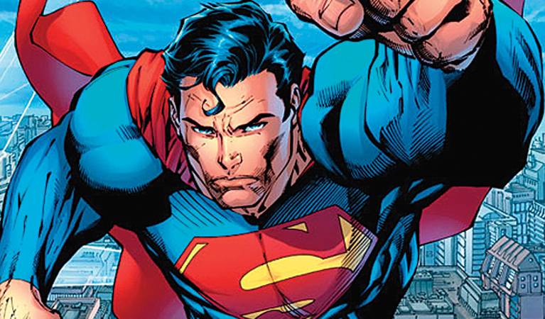
Right there in the center of his forehead, there’s a distinctive spit curl. Look closely, and you might notice that it resembles an S. You know, like the one on his chest. The one that stands for Superman. Even in a veritable sea of Caucasian, black-haired, blue-eyed superheroes, if there’s a close-up of this man’s face, the hair will tell you who it is.
Now for the cape.
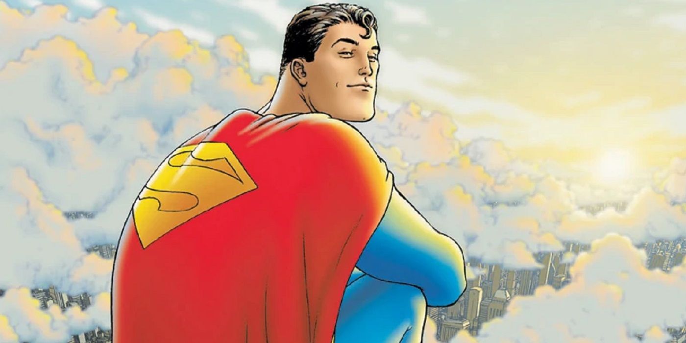
Do you know why superhero books are often called cape comics even though the majority of superheroes don’t wear them? Because the first superhero had a cape. That’s powerful branding.
But you’ll also note that the cape has that same familiar logo. It’s used a little differently but still fits into the overall color scheme of the brand. Even at a distance and from behind, you’ll recognize that guy.
Okay, but what about the boots?
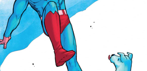
If you look closely and use your imagination just a tiny bit, you can see that the top of Superman’s boots make an M. He has an S(uper) on his forehead and an M(an) on his boots. Superman is literally branded from head to toe.
Some of these visual signifiers are incredibly obvious and some are powerfully subtle. But all together, they create an iconography for one of the most recognized brands on the planet. Even when he’s standing in a group of similarly visually striking individuals with their own instantly recognizable brands. That’s pretty impressive, and shows a detailed and intentional approach to branding.
Talk the Talk
The visual is usually the most important aspect of the brand since saying a lot without actually saying anything is pretty powerful stuff. But there’s more to a brand than the look, and we can turn to Superman again for some examples.
Did all of you know that Superman “fights a never-ending battle?” Did you know he stands for “truth, justice, and the American Way?” Did you know that he does so “with powers and abilities far beyond mortal men?” If I told you to “Look! Up in the sky!” you’d almost certainly suggest “It’s a bird! It’s a plane! No, it’s Superman!”
Just in case you’ve never heard any of that, you can certainly see that Coke has spent a lot of time and money to make sure you “open happiness.” And that Nike wants you to “just do it.” Or that KFC is “finger lickin’ good.” Volkswagen wants you to “think small.” Energizer “keeps going and going and going.” Calgon wants to “take you away.” Draft2Digital wants you to “self-publish with support.”
These small capsules of words contain a million ideas and associations that all tie back to the brand. And each one is backed by tons of research and a host of creative minds. That’s branding with intent.
Examples into Reality
Superman is a great example of intentional and focused branding. Should you expect your own brand to be that on-point immediately? Of course not. Superman’s owners have had 75+ years and spent billions of dollars (not to mention a strong dose of luck) to get to this point. But it should give you a sketch of how to intentionally approach your own branding in ways both great and small. We’ll spend the next couple of weeks taking a look at case studies of how others have intentionally branded…sometimes with terrible results.